Wednesday, August 11, 2010

Reflection of AED 200

1. What were you expectations for this course and where they met?
I expected this class to be simple, since I had taken several courses like this before, but I expected to get some good experiences with other materials. I think with the last self-portrait project alone, the expectations were met. I got a cool semi-abstract portrait, and a review of art concepts, styles, and periods.

2. Now that you've been through this course, What is art? How would you define it now compared to your initial posting?
In my initial posting I described art as a way of expression. Anything that you create could be considered art. Now I would say it is anything that is aesthetically pleasing. Anything that catches your eye, even for a second. The most interesting art would have principles and elements, and contain some type of underlying meaning.

3. Who was your favorite artist in your original posting and who is your favorite visual artist now? If there is a difference, why do you think so? If you have the same favorite artist, why do you think so?
In my original post I didn't give a favorite artist, and I don't think I have one now either. There are several that I'm interested in, but I like each one for different reasons, and as times change, and styles change, I find more new inspirational artists. I definitely took more of an interest towards abstract and conceptual art during this course though, so those artists are a central focus right now.

4. Now that you've completed this course, how do you feel about taking an online course? Is your answer the same as it was in your first posting? How is it the same or different?
I had taken a few online classes before, but never with Angel, so it was a little different. I enjoyed it. Everything was easily accessible, and the work was a reasonable amount for the time we had to do it. The only thing I feared was getting behind, but it wasn't a problem at all.

Sunday, August 8, 2010

I didn't feel inspired by many pieces at the gallery. I chose the self portrait with a monkey, by Freida Kahlo simply because I liked the color palette and the interesting composition. After the gallery, I searched some abstract self portraits online. I found a few that I really enjoyed. I really liked the simplicity of the third portrait and the monochromatic color scheme. The first composition would be fun to recreate if I was using a digital program, but I chose paint.


I chose to do the portrait in paint. I desaturated the my picture using a photoshop program, then inverted the colors to give it a more abstract look. I debated between using paint and cut paper and decided on paint, using the white of the paper, and one other color.


I had a hard time with the paint at the beginning. I kept smearing it, and started over three times. I was referring to my computer as a visual aid, and painting from that. I think it would have been easier to print the picture out, and paint from that, but it worked out okay.

My piece was an abstract representation of my face. I liked the way it looked because if you look vertically in the center of the piece, you can almost picture it as an eye and a nose of another figure looking to the left.

I knew I wanted to use one color, and have high contrast in the piece. I think it is very well balanced, and instead of having one central focal point, the piece draws attention as a whole. It was fun to break the image down into shapes, like the triangles in each corner and as the highlight on my cheek, and the watch the shapes in my lips create a feeling of shading and value.

I enjoyed the project. I had a short period of time to work on it. I wish I had more time, and I wish I could have found more inspirational pieces at the museum, but it was still an interesting project. I have done self portraits before, but I usually tend to be very realistic, and it takes me a long time to complete it. I knew with the time restriction I would have to be abstract, so I was able to try something new.

I think my final artwork was successful. I knew what I wanted to do right away after deciding I didn't have enough time to be a perfectionist and put every detail in. I now have a piece of work that is different from my normal works, which are very detailed and realistic.

Tuesday, August 3, 2010

Art Critique Review

1. Which projects did you review?
I looked at Kim Will's exhibit on Waterfalls, and Alicia Meisner's project about Change. Both projects were interesting and had a good overall theme, but I also viewed Sarah Bojaks project on Children and Impressionism and it was very well done.

2. Why did you select the Exhibit you critiqued?
It was colorful, and playful, and the subject matter of children was one of my options when I was creating my own. I thought it had a lot of strong points that I could talk about in my critique.

3. What challenges did you face in writing the critique article and how did you overcome them?
I had trouble with where to start when creating my critique. I actually went on Yahoo! and searched for a quide to critiquing an exhibit. I have critiqued artworks before, but the only other exhibit I critiqued was one from the Alrbight, for this class. I think it was easier critiquing an actual exhibit than a powerpoint slide.

4. How do you feel about critiquing your peers work?
I like it. I was afraid of being too critical, and offending someone, but the three projects I viewed were well done and I chose one that I had a lot of good things to say about.

5. Would you like to read the critique your peers wrote about your Art Curation Project?
I would love to. I think it would be helpful, and I'm very open to criticism.

6. On a scale of 1-10 how would you rate your finished article and why?
I would rate it a seven out of ten. I would like to read other peoples articles to see how they approached the critique, and if they referred to it as slides, and a slideshow or pretended it was an actual exhibit they viewed...

7. Did you enjoy working on this project?
I enjoyed it. I think after creating my own project, while critiquing others, I was comparing it to my own, and I believe it helped my knowledge of exhibits greatly.

Monday, August 2, 2010

Six Video Reviews

In the video, Greenberg on Art Criticism, he discusses the important things to remember when critiquing art. In his opinion, visual art is the hardest to critique. He states that he has a hard time not being biased or expressing his own preferences, but you have to be open and receptive when critiquing. Greenberg tries to focus on being relevant, and having good reasoning. When viewing works, we've been reminded to be receptive, and open, and this video reinforces those points.

In the next video, Clement Greenberg discussed the art of Jackson Pollock. He talks about how he knew Pollock was going to be a great painter, and when Pollock painted his first drip painting in 1947. He discusses the nontraditional works of Pollock, "outside of the box". He gives Pollock a lot of credit for his works, and even talks about how Pollock rejects criticism of his works. I think this applies, because some people may not take the advice we have to improve their exhibit. They may think otherwise and completely reject what we say.

The third video talks about the Renaissance and the renewed enthusiasm for art. It includes information about works by many famous artists, encompassed in Visari's book "Lives of the Artist". They discuss how art is changing and each artist learns something new from the ones who came before them. It doesn't give suggestions for critiquing like the other videos, but it does contain some criticism of works in the Italian Renaissance. The text accompanying the video stated that Vasari's book has been the basis of art criticism since the 16th century.

The video, The Critics: Stories from the Inside Pages, features several critics talking about their own criticism and opinions of others. It starts by talking about what criticism does, and how it is a good thing. It has input from book critics, music critics, and visual art critics. Critics are people who are willing to make an argument, and often act as reporters. It makes me think mostly of movie critics. They put their own opinion on movies, and persuade other people to see things in their way. Some artists don't see critics as helpful though. Some think they send out the wrong message, and are too critical. The video encourages us to see all of the possibilities in artworks, and to really think about works which we see and hear everyday.

I found the video about The Colonial Encounter boring, and not very informational as far as art criticism goes. It talks about Colonialism and The Worlds Fair, and the woman is discussing the different cultures and art. There technically is criticism in it, as she describes it, and interprets it, but its difficult to understand and not a good video to learn from.

While Pollock was praised and admired in the video with Greenberg, the last video notices him as a great artist, but discusses how he brought negative comments to Modern Art. Michael Freid and T.J. Clark discuss his work Lavender Mist and both show their different approaches to critiquing art. One focused on the power of it at the time period in which it was created, and one of them discussed it strictly based on the way it looked, and the beauty and aesthetics it had. I think this is an important video because you get to see two different views, and how they took in each others opinions and combined it with their own. It reinforces the fact that each person has a different opinion and interpretation of art, and each critique would be different.

I think the first two videos and the last video were the most helpful. The last one with the two critics going back and forth about Pollock's paintings was interesting to watch. Each one had their own way of seeing it, but wasn't opposed to hearing other views. After the first video with Greenberg, he seemed to really stand his ground, and think his opinion was the only opinion, but the two in the last video seemed very open and reasonable.

Friday, July 30, 2010

Art Curator Project

I found the art curator project to be very challenging. The hardest part about it was finding the works. I was looking to make it a more broad theme, but then struggled with finding sufficient works. At first I considered doing something with works where the background outshines what is going on in the foreground, because those works intrigue me and it would make for an interesting exhibit. A good example is Edward Hicks' Peaceable Kingdom. In the foreground the animals lay together, but the men in the background and William Penn become the spotlight. How I would search for works like those was the problem. I decided to go with a theme of death, and try to work in elements of nature and abstract works as well. I think it turned out okay, but I'm not completely satisfied with it after viewing a few other students projects. I still think my theme is too specific, and would have liked to do an exhibit with a more broad, interpretation based theme.

Thursday, July 29, 2010

Film Review; Week 9

The first video, Lowdown on Lowbrow, introduced and discussed the Lowbrow genre. Lowbrow is similar to pop art, but is generally surreal, and often includes television characters. It often included naked women and automobiles, and animated art that didn't fit other categories. Some people argue that it should be named Lowbrow Surrealism, and it reminds me of the surrealist paintings in the book. This helps with our project because these are works that didn't really fit into other categories. With the choosing of our works, we're arguing why they should fit into our theme.


The second video discusses the approach to displaying modern art in the Tate gallery. Art of the 20th century was displayed chronologically. They broke their works up into four groups, or exhibits, which each piece is carefully categorized. The movie focuses on grouping of artworks and the job of a curator breaking up the works into groups and themes. This relates to the project and trying to categorize our works, and the overall understanding of a curators job, and how the works should be displayed.


The video about Native American Archaeology features a woman making a stand for the protection of Indian burial grounds. They fought for the protection of bones and remains being dug up, and for the ones being held in museums around the country. The remains tell a great deal about the past, and should not be destroyed. By researching the bones, and where they lay, a lot was determined about the past and Indian culture. Research about skulls and brain size in relationship to intelligence were done based on these remains. The video was interesting, but not as strong of a connection to our Art Exhibit project as the rest.


The last video is about the George Eastman House in Rochester. It discusses his creation of the first camera, and the collection the visual history of photography. It talks about the thousands of different kinds of cameras and lenses, and works from over 14,000 photographers. I could relate this video back to the Exhibit project, as we could be using photographs in our made up exhibits. It talks about the actual house, and the rooms in which the works are exhibited, which is an important part of how the works are portrayed.


I thought all of the videos were interesting. I think the second one was definitely the most helpful as far as the project goes, but the video about Lowbrow art was very informative as well because I was unsure what it was, and I think a few of the works I looked at while searching could be in that category. Overall, very informational, but I felt the Native American one was very repetitive and not well related to the project.

Friday, July 23, 2010

Video Review; Week 8

The first video I watched was Matisse and Picasso. Gertrude Stein was the first to realize the potential of Picasso and Matisse and suggested that they meet. They met and exchanged artwork to show their respect for each other. It echos a lot of stuff stated in the book in the biography section for each artist. It uses Picasso's Les Demoiselles d'Avignon and compares Picasso's cubist beginnings to the work of Matisse. Matisse and Picasso arrive at similar results in their artwork, but Matisse's work is organized and well planned out, while Picasso's work is impulsive.

The second video was The Dance at the Moulin de la Galette. I chose it because it gives an insight to the painting, and the work behind the masterpiece. The video discusses the setting in Paris and the place where people gathered on their day off to relax and enjoy themselves. Renoir enjoyed capturing people in their everyday lives, doing leisurely activities. The video also touches on the lighting, and brushstrokes used to capture it. The book tells us that Renoir liked to paint optical sensations such as the lighting coming through the moving foliage on the trees, as he did in this painting. I find it interesting that they discuss the figures in his paintings, and how they reoccur in other paintings and were sometimes reluctant to pose.

The Sunday on la Grand Jatte was the third video I watched. I wanted to know more about the piece and was hoping it would say how long it took him to complete it, using pointillism and color blending, as opposed to a normal brushstroke painting. There is a lot of mystery behind this painting that I didn't know about. It was discovered by x-ray that the monkey was a last minute add on, but a monkey behind out on a Sunday stroll is very mysterious. Maybe his painting wasn't as mysterious as he planned it to be, so he had to add something in? Seurat's figures were solitary figures, which cast shadows, and often had hidden faces. The Grand Jatte was known in Seurat's day, as a place for prostitutes, and the riverbanks were often covered with couples making love. In the painting, there are several women alone, maybe suggesting that they were prostitutes.

The video about Abstract Expressionism and Pop Art covers a wide array of artists and information. It talks about Pollock, Warhol, Lichenstein, Klein and several other artists discussed in the chapter 22. The beginning of the video is spent describing Klein's painting C&O. It discusses the color qualities themselves and the nonrepresentational approach. Each color expresses a feeling or idea. Different uses of lines and , like the flowing lines in DeKooning's work can also be used to express feelings. Like the book, it discusses the element of energy in the work, whether referring to implied movement or the brightness of colors. I like looking at the contrast between the abstract expressionism and the elimination of recognizable objects to pop art and the use of popular objects in art, often repeated, like in Warhol's Campbell's soup piece.

These videos were very educational. I chose the ones that were semi-biographical to get a glimpse into the life of the artist, and their opinions on their works. Knowing their comments on their own work helps to interpret it as well. The chapters, especially 22, which covered the two opposite styles of abstract and pop art, were filled with information, so watching the video and seeing the works described and the intentions behind it helps out.

Monday, July 19, 2010

Mask Making

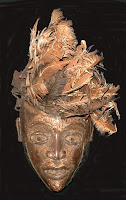
I found the first mask by searching ritual masks. I think it intrigues me because of the disheveled feathers atop it. In a traditional mask, there would be a line of feathers, symmetrical, and neatly placed. I wonder if they were originally placed unorganized and bent, or if they were neat to begin with, and got destroyed over time.

The mask has a golden color, and appears old and worn out. Atop the head is the pile of feathers from a light golden color to a dark brown. It has normal facial features; two eyes, two ears, a mouth and a nose, and a pointed chin. I think the point of the chin leads you upward around the face and to the feathers, which lead your eye to the right, away from the face. The golden color makes the mask appear important and rich.
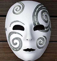


I came across the second mask in a Google search for masks. I enjoyed the simplicity of the mask, and the lack of symmetry between the sides.
I plan to include those features in my mask, hopefully using the swirls in the piece as movement throughout the whole piece.

The mask has a white base color, and details done in gray and black. The eyes of the mask are blacked out, as well as the lips, which gives it a mysterious look, and almost an evil eye. On the left, below the eye there is a medium sized swirl, along with a small one in the lower right and upper left, and a large swirl in the upper right, which goes through the eye. Above the left eye, there is part of a swirl, which appears as an eyebrow. There are two small holes as nostrils at the bottom of the nose, and two circles on the sides of each eye as well. Although their is movement among the swirls themselves, your eye is drawn to the deep darkness of the eyes as a focal point.
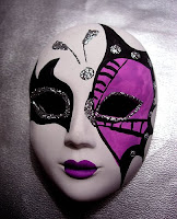


Like the last mask, this one is also unsymmetrical. I chose it because of its feminine qualities and the contrast between the two colors used. I will use two to three colors in my mask, and possibly glitter as well.

The base of the mask is white, with black and purple details. Around the left eye, there is a black patch, with flares outward towards the edge of the mask. Directly around the eye there is a line of glitter. The right side is similar, but on a larger scale. The shape is repeated, outlined in black, but filled in with a medium purple color. In the black outline, there are glitter dots. The lips of the mask are purple, and in the center of the forehead there is a circle of glitter, with two shapes coming off from it, which look similar to antennas. There is a good balance in the mask. Although the left hand side has a smaller design than the right, th
e left side is heavy because of the darkness of the black, and balances out the large shape on the right.
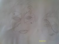


My goal was to make a mask that was simple, unified, and had feminine characteristics. In my initial sketches, I had planned to make hair on the head, but I thought it looked prettier and more feminine without it. I also planned to make the lips red, which I did, then covered in black because it made the picture off balanced with the red from the right eye and the lips so close together. I wanted it to be balanced, but not symmetrical, so I did that by doing mirror images between the two eyes. I wanted the colors to be contrasting, but not complementary colors.
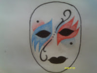

In my final piece, I incorporated the swirls from the second mask, and the shapes around the eyes from the third. I colored the eyes in black, and put shapes around them. The left one was blue, and the right one was right. Then I decided to put black dots at the inner curve part of each shape, above the left eye and below the right eye. To bring that together as part of the eye shape, I made ovals from the top to the bottom of each eye, and shaded them in the opposite color, fading out as they went past the black circles. By the shading, and fading of the red and blue, I think I achieved the femininity I was looking for. It makes it softer, and more playful than if they were shaded in bold red and blue. On the outer curve of each eye, I made a swirl shape, leading you away from the eye, and curling towards the center of the face. Between the eyes, at the start of the swirls, there are three dots, which I find to be the focal point of the piece, even though they are the least pronounced. The black of the eyes and lips are dominant, and bring your eye in to the center of them, then the swirls lead that way, and my eye stops at those three little dots.


I enjoyed the process. The first sketch I made in my sketchbook was actually my favorite one, so I made a few minor changes to it, and created my final piece. I found it more difficult finding the inspiration pieces. I liked a lot of masks for different reasons, but they were all so unique, I didn't know how I would tie the three of them together into one final piece. Actually coloring the mask once I had my idea was fun. I haven't used colored pencils in a while, and forgot how much I love them.

Thursday, July 15, 2010

Third Video Review

The first two videos I chose were the Buddhism and Hinduism videos. I chose them in hopes of getting a better understanding of the two religions, and to better be able to differentiate between them. I read about Buddhism in the text, and when reading about the eightfold path, and the cycle of life, it was all familiar to me, but Hinduism, not so much. In the Buddhism video, they talk about the "middle way" of living, as Buddha referred to it. It discusses how they could exist on earth, but not be a materialistic part of it. They practiced simplicity and meditation of the spirit, following the eightfold path. After Buddha died, Buddhist art and architecture expanded. The narrator speaks of how each building is beautiful and narrative, as each one has a story, whether its how it was formed, or within the symbols carved into its detail. The Hinduism video starts off discussing beliefs--they believe in many gods, and believe in reincarnation and the cycle of death and rebirth. They show a cremation ceremony in which they believe the flames release the soul from the body, and allows it to come back in another life cycle. Art and architecture flowered, and shifted from wood to rock(Panch Rathas example). They loved their temples, as well as their homes to be decorated lavishly.

The third video I chose was African Art. It states that African art is based on tradition and is found everywhere. From hairstyles, to clothing, to clay pots and everyday objects. A lot of the African art is based on ritual and created for ceremonies and celebration. It is mentioned that animals, plants, and even rocks, are said to be effected by spirits. They show several different traditional art such as rock art and carvings of animals and humans and the symbolism behind it. The book goes into a little detail about rock art, and early carvings of humans and animals, and like the video states that they were stylized, but recognizable. The meaning behind them was unknown, but maybe they didn't have any symbolic meaning behind them, maybe they just carved what they knew--what was common surrounding to them.


The last video was African Art, Legacy of Oppression. Narrators discuss different sculptures within the collection, mostly human figures. They discuss masks, and the twisted form of one of the male sculptures, which was uncharacteristic of normal African art. There was also magic art, which had doors for 'potions', and were used as tokens of revenge, and most common in magic art; masks. There are several different types of masks, all sending different messages, and some for ritual use. The book discusses masks, mostly for ritual use, but the way in which they were designed said a lot about their uses and purpose.


I liked the two videos of Buddhism and Hinduism the best. Although they were tougher to understand than the others, they had good content, and went into just the right amount of depth for proper understanding of the culture, and religion. Seeing the practices, like the cremation ceremonies, and seeing some of the artwork, gives a much better understanding than just reading about them in the book, and seeing still photos.

Saturday, July 10, 2010

Art Gallery Visit #2


I visited the Albright Knox Art Gallery to do this assignment. The title of the exhibit I looked at was The Alphabet, by artist Fletcher Benton. The exhibit theme was letters A-Z, and numbers as well created using painted steel. Benton's intention was to transform two dimensional fundementals of communication into sculptural art.

The art was exhibited in glass cases, a few sculptures were on pedestals, and there were large wall hangings with photos of larger scale sculptures in an outdoor setting. There was recessed lighting in the ceiling of the room, and sidelighting in each one of the cases, which were relatively dull, but cast shadows behind each figure. The walls of the room were a cream color, and the cases around the figures were wood grain. When walking through the space, you come to a case on your left, and a connected one to the front of you, creating an L shape. You walk to the right around the case, and see the large hanging panels on the wall. In the center, you turn and are surrounded by a case to three sides. The third section is opposite the first, and each section had two pedestals.

There were three to four sculptures in each showcase, and there seemed to be no order to the numbers and letters. Each one of the sculptures was set on a black base, and each case seemed to have a similar color palette. Some of the "letters" were more recognizable than others, and some were more intricate. The artworks were not framed, except by the wood around the cases themselves. At the bottom of the display window, there was a label for each work, and each label had the artists name, the collection name, and the letter that the sculpture represented.

I chose sculptures of letters C, T, and Y, each of which have a different approach to the structure of the letters.

The letter C is protruding from the basic square shape, which some of the other sculptures do not. This particular one is painted red, and has a red circle lying on a slant on the side, as if it had fallen out of the center of the C. The C itself appears thin and delicate, as if that was the impression of the letter C that the artist had. The C is connected to the corner of the folded square piece, and appears as if it could be pushed back into place in the larger circle, almost like a swinging door.


The T sculpture is a bit more complex, and looked at from a different angle. There is a square of metal, folded in half, creating two equal rectangle shapes, which are painted blue. On one side there is a circle cut out, and the other side has a circular shape sticking outward. Through the center of the square is the stem to the letter T. The top of the T sticks out perpendicular to the side of the square. It appears as if the T could be turned sideways, to fit into the side panel of the square. There is a cut out, creating a triangle at the top, and a small rectangle to the front of the T, where one of the sides of the top would fit. The T appears as if it is part of something, more included than the letter C, and the side with the T is heavier than the side with the open circle, perhaps implying a heaviness to the letter.


The Y was one of the more interesting letters, and tougher to identify. It was painted red, and placed on a black base, like all of the sculptures. Again, there was a folded square, creating an L shape when viewed from above. On the larger side, there was a circle cut out on the right side, but still connected on the left, and pushed backwards. On the smaller side, there was a small square cut out at the top, and pushed backwards. A small line at the bottom on that square, and on the side towards the fold were cut, and the square was pushed upwards, creating the top to the Y. The stem to the letter was down through the circle, much like the letter T. About half way through the circle, the stem of the Y switched from being a solid line, to a rippled, zig-zagged line.

Friday, July 9, 2010

Four Video Review

The first two videos I chose were La Primavera, and The Night Watch. I like learning about specific paintings and the reasoning behind them, so I thought I would enjoy these. Both videos begin showing the paintings behind acted out by actors and actresses. La Primavera talks about Botticelli's painting and the interpretation of critics. They try to find a relationship between all nine figures in the painting, but it is uncertain. Some people see it is a sexual painting as all of the girls are dressed in light airy clothing, but some see it as the coming of spring, since that is the translation of the title. It brought to my attention that Cupids arrow is aiming at the group of girls, not Mercury on the left, and that the two figures on the right are really the same person, one is transformed into the other. In The Night Watch, Rembrandt's painting has some questionable aspects as well. The painting has been heavily damaged; cut with a knife, had acid thrown at it, and it was drenched with water, but it survived. It suggests that Rembrandt was commissioned to include rich merchants in his painting. On page 367 of the book, while discussing Botticelli, it talks about the philosophhy of Neoplatoism, and in the movies, the narrator says in order to find the meaning behind the painting, they go back to the philosophies of Plato. In the book, on page 394, The Night Watch is discussed, and they state that all of the members of a commisioned painting were normally seated around the table or lined up for the 17th century equivalent of a class photograph. In the video they discuss this as well, stating that you could decapitate everyone in the photograph with a single swipe.

The next video I chose was the Albrecht Durer video. I chose it because I thought he was a printmaker, but I learned that he was much more than that. He was great at portraiture, but he excelled with landscapes as well. The video tells much of his background, as discussed in chapter 8, along with an interpretation of his woodcut, Four Horsemen of the Apocalypse.

I chose The Power of Art :Caravaggio, as my last video. I liked the title of the video, and I knew there was one of his paintings discussed in Chapter 17, that the video would hopefully give me more insight to. Both the video and the book discuss the drama behind Caravaggio's work, and how he focuses on the here and now. From the video I learned that he used random people off the streets as the model for his works, and that he was much more on the dark side than I thought, not wanting to do things the way they are supposed to be done. In the first painting shown in the video, his head is in the lower right corner, and the narrator suggests that he was sacrificing his head in the painting, to save himself in real life.

I feel like the videos are much about interpretation and the way we see the painting, especially the first two where the meaning is uncertain. I don't feel as if these videos were as relevant to the current chapters as the last group of videos were, but they were still informational, and I did learn some interesting facts from them.

Sunday, July 4, 2010

Installation Project

Step 3.
Installation art is three-dimensional art that changes a space, adding elements and materials that encompass a certain theme.Any materials can be used in installation art. Usually all materials are related with some concept, and spread throughout a space. Installation art is created to draw the viewer into the work, giving them a three-dimensional piece of art that can be viewed from different angles. I enjoyed the Red Room installation by Louise Bourgeois because of the different perspectives. We see a view from inside the room where you can see almost everything that is going on, but they also show a view from outside, with the door closed. That would cause the viewer to look at the piece through a frame, and have to look to the left and right and take it in little at a time.

Step 4.
At the beginning of the video, he describes an installation as something that is all around you, something you are caught up in. Richard Wilson wanted to change his own perceptions of interior design, as well as other peoples views. I wanted to use nature in my installation, because I like the outdoors and it seemed like a good backdrop for several ideas. I wanted to keep it simple, so I just used sneakers, as a repetitive pattern on the sidewalk. I had initially planned to use sidewalk chalk and make footprints with that as well, then considered making the footprints go up the tree in my front yard, to make it a little more awkward, but the chalk did not work on the bark. Placing the shoes on the sidewalk seemed proper, and showed movement down the path, with a pair of shoes from each person in my household.

My installation consists of seven pairs of shoes. There are boots, sneakers, soccer cleats, and a pair of flip flops. Two pairs are black, two are white, one is pink, and two are black and white. They are laid out in pairs, one after another, going down the sidewalk in front of my house. It covers about a nine foot span. They alternate from side to side, but still create a general line down the sidewalk.

I attempted to create pattern, rhythm, and unity by laying out the shoes so the colors alternated and I created balance by staggering the shoes, and the color pattern. There is a little emphasis on the pair of pink shoes since all of the other shoes were black and white, it draws your eye towards it as a focal point. There is implied movement, just by running your eye down the line of shoes, as well as the fact that they are shoes, and it appears as if you would step from one spot to another.

I think it would be more interesting to make an installation in a place where it shouldn't be, rather than in a place where it is natural. It would really cause people to stop and look, and question why it is there. I do agree that the site has a lot of influence on the meaning though, like the stamp in Cleveland that says free, in front of a government building promoting freedom and free speech.


Logo!


I liked creating my own logo. I had a little difficulty because I used ink and it wasn't drying, and I was using thin drawing paper instead of proper pen and ink paper, but it turned out okay...

When creating my logo I really had to stop and think about characteristics that I had, and think about how to convey them on paper, simplified into logo form. I just started drawing and testing different designs, adding to them as I went. Right away I knew I wanted to use my initials for recognizable purposes, but I wasn't sure how I wanted them to be laid out. I wanted it to be unified and balanced, and girly. I put my initials in lowercase because I felt that it flowed better, and I added small streaks of pink and purple watercolor to make it girly.

I discovered that I am a very "plain-jane" type of person. I love color, but I only like it in pops and I like things to be simple. I feel like simple things come across as peaceful, where complex designs are too busy and heavy, especially for a logo.

The video and powerpoints were a little helpful, but since logos are so diverse, there aren't really rules for creating one. After watching the videos, I had an idea in my head, but it was still up in the air about where to go from there, and how to start, so I just started drawing and came to a logo design on my own. I am fascinated however, by how much changing a logo can change the image of a company, and almost give it a whole new start. People still know the brand name, but changing the symbol that represents them can even draw in new customers, and improve their reputation.

Saturday, July 3, 2010

Through the Eyes of a Sculptor:
This video is about a sculptor named Emmanuel Fillion and his process from initial inspiration of a sculpture, to his final work. This video gives a good overview of the time and effort put into making a single sculpture. The video goes into the process of modeling, casting, and carving the figure, which reminded me of the mold techniques shown on page 241 of the text. This video also talks about the transportation of the rocks, and molds, which is brought up on page 243 of the text, explaining the size of some of the boulders transported that weighed up to 44 tons!

Glass and Ceramics:
The video explains the everyday uses of glass and ceramics and how each one of them is created. It explains the improvements in glass and ceramic techniques, and where the creation processes are likely to go in the future. It discusses the different properties of glass, and the purposes of stained glass, bulletproof glass, double-pained, and tempered glass. The properties of ceramics and glass and their similarities are discussed in the beginning of chapter 12 in the textbook and also include facts about changes in melting point, strength, and color which I thought were interesting. It also discusses glass in architecture and how it is replacing wood and brick work, which is mentioned in the Architecture chapter.

Installation Art:
From the video I learned that installations are very site specific and can be installed anywhere, indoors or outdoors. They can consist of any objects, which are all related to a theme. Installations are very difficult to set up so they are usually installed and remain there for a good period of time, and are chosen very carefully by museums and galleries. The book shows good examples of installations, and their themes, and all of them relate well with their surroundings (site specific) as the video stated.

Prairie Style:
This video discusses Frank Lloyd Wright's Prairie Style home. It had many unusual characteristics, and strives to have as much window space as possible, and avoid any Victorian house characteristics. It talks about architecture that blends in with the landscape, and the organic shapes Wright used for a more natural looking building. The picture of the Guggenheim Museum building in the textbook shows use of the organic shapes discussed, and also ties in the large glass windows for a more open natural flowing feel. There is also an example of Wright's Fallingwater home, where the house appears to be perched right on the edge of a waterfall, as a part of nature.


I liked the video about glass, and installations the best. The glass video because it gave details on how the bonds were formed, and how different combinations create different types of glass. It also discussed the uses of glass, and it made me realize how many things in our house are made from glass, or could be made from glass, and how many things are changing to reinforced plastic or fiberglass for safety. I liked the installation art video because I love three dimensional art, and being completely surrounded in the artwork. Being able to interact with it, and navigate it makes it more appealing to me than staring at a picture on a wall.

Thursday, June 24, 2010

Peer Review!

1. Hyperlink the Blogs you reviewed into your Blog
http://bojasc72.blogspot.com/
http://williacv01.blogspot.com

2. Were there any images in the Peer Blogs the same as your own? If yes, what were they? Were the reasons the image was selected the same or different as your own?
In Christine's blog, she also chose 'The Yellow Christ' painting. We both said we chose it because we felt a connection with it. My connection was simply because it is such a prominent painting in art history, seen in books. She felt a connection with it simply because it was a representation of Jesus Christ and his followers, as she is a follower of Jesus.

3. Were there any images that your Peers selected that pique your interest now? If yes, what are they and what is your connection with them? What would you want to know about them?
There was one which I considered choosing for my own post, for similar reasons. Christine chose the Still Life #2 by Tom Wesselman, which I also enjoy, but don't fully understand. The connection of the sink, cabinet, food, and the fact that their is one of Mondrian's paintings thrown in there is confusing to me, and to Christine as well. Why incorporate another artists painting? Why the different elements, different rooms?

4. What do you think about the process of reading your peers reflection? Do you find this to be a valuable in your learning?
I like the process of peer review. I think it is helpful to hear other people's feedback. If they agree it is assurance that I am looking at it objectively and getting a good idea of the artwork, and if they disagree it is an opportunity to tell me what they see, or how they perceive it.

5. Check your Blog and read comments posted by your peers. Do you find their comments helpful?
I don't think it is helpful as much as it is just reassuring. The comments I received so far just state that I did well on my value scale and color wheel, which I appreciate hearing, and that I had good reasoning behind my choices from the art gallery. One comment stated that they had questioned the meaning behind the Numbers in Color painting as well. It is good to hear that other people are on the same page!


Thursday, June 17, 2010

Value Scale and Color Wheel!

1. Discuss what you thought about creating the Value Scale and Color Wheel.

Well... I started my value scale at about eleven thirty at night, thinking it would take me less than half an hour. When I finished my scale, it was almost one o'clock. I was unsatisfied with two attempts, so the photo on here was my third attempt at creating a value scale! The color wheel was much more fun and playful, took me back to feeling like a kid again.

2. Which media did you enjoy working with the best and why?

I definitely had a preference towards the watercolors over the charcoal by the time I was done. I usually enjoy charcoal, and I have a few portraits at home I have created using charcoal, but a blend of a few different kinds of charcoal. For the scale I was trying to stick with one, compressed charcoal, and drawing on a separate sheet and transferring it using a blending stump for the lighter values. The water colors were simple to mix and I was pleased with the result.

3. What was the most important discovery in the creation of these studies?

While I was creating my color wheel, I was messing around with colors on other sheets of paper too. I was trying the techniques from the 'How to Mix Colors' video. I like the Wet-in-Wet mixing, and tried using it, mixing several pairs of colors. Each pair of colors reminded me of something, red and blue reminded me of the sky, as well as cotton candy, blue and green reminded me of water, and the earth, and yellow and green brings a grassy field type of feeling. I discovered that I really like the use of watercolors, and the bright playfulness of them!

4. What is the most important information you learned from watching the videos for this project? What is your opinion of the videos?

I liked the end of the watercolor video, where he explained how he mixed the blacks, and how you could add other colors and gray them out. I think I would use that, its good information to know. Both of the videos were very helpful. Unfortunately, I didn't watch the value step scales video until after I had started my value scale. After watching the video, I'm convinced I would have liked the results better if I had used pencil as opposed to charcoal.

Wednesday, June 16, 2010

Art Gallery Visit #1

1. While walking around, there were several pieces that caught my eye and made me look closer, but a few of them really made an impact. Jackson Pollock's oil painting, 'Convergence' (1952, 93x155in) had an impact on me because of its scale. It is abstract, but you can look at each paint drip and the layering and it is amazing. The second piece that really pulled me in was William Harnett's, 'Music and Literature' (1878, 24x32in, oil on canvas). Everything about it was so realistic, and for being of such a smaller scale, he paid close attention to detail, texture, and the preciseness and repetition of the triangular shapes that unify the piece. The third piece was Agnes Martin's, 'The Tree' (1965). It is so simplistic yet inspiring. From afar it appears as a plain canvas, but up close it has a precise grid lightly drawn in. A simple grid on a canvas got her recognition and a spot in the Albright Knox Art Gallery. It impacts me because I know that there are people who look at that and think "I could do that", and don't have appreciation for it. Yet, I know it is recognized because she was the first person to do it, and that's where creativity plays a big part in art. Open-mindedness and being the first to do something could take you places.


2. I found that the works I felt most connected with were works that I've seen before in textbooks, and in general society. It's cool to be able to go to a local gallery and see world famous paintings that you've learned about and researched. I chose "Peaceable Kingdom", "100 Cans", and "Yellow Christ". Edward Hicks painted 'Peaceable Kingdom' in 1848(24x32in). From reading about him, I know that he was known as an outsider artist, or naive artist, meaning he had no formal art training. From knowing that, I am fascinated by the detail and the thought behind his work. '100 Cans' is Andy Warhol's famous Campbell's Soup oil painting (1962, 72x52). I felt a connection with this piece simply because of how well known it is, and it was a common reference in art classes in my childhood. The third painting that I felt a connection with was Gauguin's 'Yellow Christ' oil painting (1889, 36x28). Again, it is in several art history textbooks, and its quality appears child-like. It doesn't have a whole lot of detail, and I like when I feel like I could re-create a painting done by a famous artist.


3. I chose three pieces that I either didn't understand, or became curious about. The first piece was Jasper Johns' "Numbers in Colors" (1959, 169x125cm). It was done with encaustic paint, and layered on very thickly, but I wanted to know if the numbers had any meaning? I looked it up online afterwards and found out that he used symbols in alot of his works, without a real explanation, but I still think it is interesting. The second oil painting I chose was 'Elegy to the Spanish Republic #34' by Robert Motherwell (80x100in). Looking at it, I knew it was an abstract painting and was trying to interpret it myself, but after reading the title I knew there had to be some story behind it. The third piece was "Child's Blue Wall" by Jim Dine in 1962 (60x72in). I was curious as to where he got this idea. I think it would be very interesting if this is actually what his sons room looked like, with that same lamp.

Monday, June 7, 2010

Color Theory and Emotional Effects

Color is everywhere, and it has more of an effect on peoples lives than they think. It fascinates me that simply being in a room that is bright colored could boost your mood, where a dark, dull room could make you feel depressed. People choose artwork for rooms based on the color scheme and the feeling they want to bring to the room. Color is used frequently to portray an emotion. Red is a strong color which usually displays strength, heroism, fierceness, or anger. A more cool color like blue could portray happiness, calm and relaxation. A few colors placed together could be used to illustrate anything from harmony to conflict.

My favorite part of the Color movie is towards the end when June is talking about her painting and says while she is painting she has to keep reminding herself of the feeling she had while she was in Venice and saw that scene. I think its critical that you are thinking about how it made you feel, and not letting your current mood be reflected in the painting, if that's not what you want. If you are working on the painting one day while you're really upset, and another day while you're really happy, you can usually tell the difference, unless you stay in that same state of mind that you once had.

I think the Feelings; Emotions and Art video had an impact on me when it was talking about Goya and his change in painting style after his illness. He went from painting colorful scenes of picnics and happy places, to painting darkness and negativity. His change of mind came after eras of war and loss of political hopes. He wanted to paint the life he felt, the oppressive heaviness he felt in the world. The feelings that he had at this point in his life, after all he had been through.

Tuesday, June 1, 2010

First Blog!

1. MY Buffalo State user name was not available when I tried to create my account, so I added another zero, but other than that, it was pretty simple. The hardest part was coming up with a title for my blog, and a URL.

2. I expect this course to be more broad of an art history class than any I've taken before, because it focuses on the fundamentals, and not a specific period. After browsing through the book, most of the material looks familiar to me, but I'm interested to learn about the rest.


3. I enjoy the thought of an online course. I like working at my own pace, and at any time. I am slightly nervous though, as far as forgetting about an assignment, or thinking I missed something somewhere on Angel, since I'm unfamiliar with it.